Product Designer · UX/UI
Building clear, trustworthy digital tools
from user research to implementation.
Learned the rules. Practising the exceptions.
About
Shaped by business, technology and media.
I am interested in how digital products are structured, how they guide people and how they create trust. For me, design is not only about the surface, but about clarity, usability and the decisions that make an experience feel effortless.
What fascinates me about UX is that good design often goes unnoticed. When it works, people simply understand where they are, what they can do and what happens next. That is the kind of design I want to create: useful, trustworthy and calm, but with enough character to feel distinct.
Outside of design, I am drawn to experiences that combine structure, atmosphere and detail, whether in games, movies or cooking. I like it when many small choices come together to create something people remember.
Work
Process
Discover
- Desk research
- Competitive analysis
- Stakeholder workshops
- User interviews
- Heuristic evaluation
Notion · Dovetail · Google Forms
Define
- Problem framing
- Personas
- User journeys & flows
- Information architecture
- Feature prioritisation
FigJam · Miro · Jira · Confluence
Develop
- Wireframes
- Visual design
- Interactive prototyping
- Usability testing
- Component & token systems
Figma · Affinity · Adobe CC · Maze
Deliver
- Frontend development
- Accessibility implementation
- Performance optimisation
- Design-to-code handoff
- Documentation
HTML/CSS · TypeScript · React · Astro · Git
The framework above is the foundation; the reality is iterative.
I use these phases to turn user insights into clean, buildable interfaces.
AI tooling accelerates the routine work; the decisions stay mine.
Contact

“Ever since I was young, I dreamed of optimising cross-functional communication frameworks, streamlining end-to-end user journeys.”
01 · Context
This project was developed as my master’s thesis at TH Brandenburg. I owned every part of it, from research and assessment logic to interface design and front-end development. The thesis addressed a practical design-stage question: How can UX designers support fair monetisation in video games while balancing ethical standards, regulatory requirements and commercial viability?
The timing matters. Monetisation is now a core layer of the player experience, and EU consumer-protection enforcement increasingly targets issues such as unclear pricing, frictionless spending, pressure cues and weak safeguards for minors. Teams need ways to identify risk-sensitive design properties early, before a flow becomes expensive to change.
02 · Problem
Monetisation decisions are often made through interface design: how prices are shown, how offers are framed, how easy it is to accept or decline and how much pressure a player feels at the point of decision.
Monetisation being legally sensitive is only half the issue. The practical problem is ownership. Design teams shape many of the relevant decision points, yet they often lack a shared structure for recognising fairness risks before implementation.
Legal review usually happens late, while design teams work in different terms: clarity, friction, urgency, consent and player control. This creates a gap. Fairness risks can stay invisible until a flow is already built, even though many of them are visible directly in the interface.
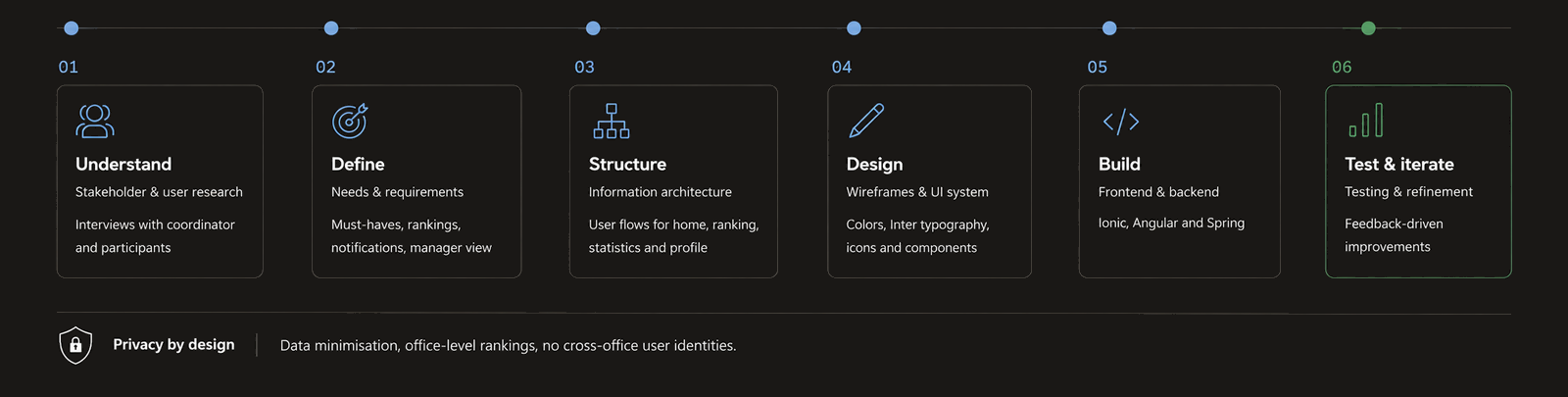
03 · Process
I started with literature and desk research across four areas: monetisation economics, player spending psychology, UX research on dark patterns and EU consumer-protection expectations. This gave me the basis for identifying where fairness risks emerge in video game monetisation: price presentation, consent, friction, pressure cues and safeguards for minors.
The core challenge was translation. I had to turn abstract ethical and regulatory expectations into practical indicators that can be answered by inspecting the user journey itself, without backend access, analytics data or assumptions about developer intent.

To ensure day-to-day utility, every design indicator had to be strictly observable in the interface, consumer-protection relevant and actionable during early design reviews. The structure was refined through iterative review and feedback, especially around where the assessment needed to stay conservative. It could flag risk signals, but it should not make legal claims or imply measured harm.
This process led to four risk domains and 12 guided questions. Three examples:
Real-money price visibility
Can players see a real-money price, or a clear equivalent, at the point of decision?
Friction symmetry
Is it no harder to decline or cancel than to accept or start?
Protection of minors
Does the design avoid directly urging minors to buy, or pressuring adults into it?
04 · Solution
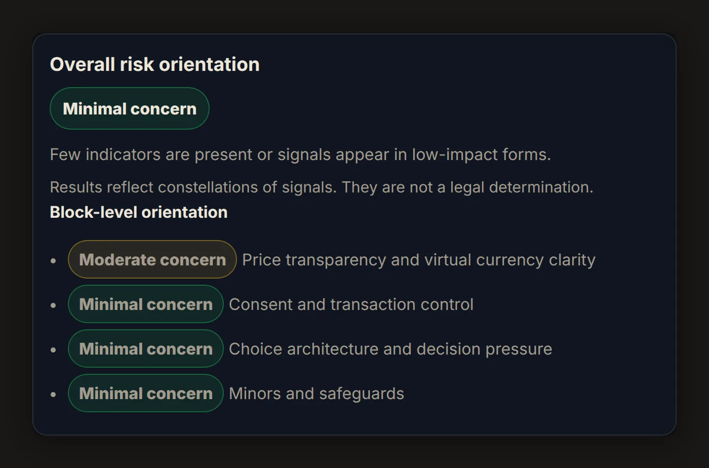
The result is a live, web-based assessment workflow. A team runs one monetisation flow through three steps: context, 12 guided questions and result.

“Unsure” is not treated as neutral. It becomes a weak signal, because uncertainty at the decision point is itself relevant for review. Co-occurring indicators raise the concern level, because risk mechanisms in monetisation tend to compound rather than act in isolation.
The assessment returns an overall concern level, from minimal to moderate to elevated, plus domain-specific areas worth reviewing. The logic is deliberately conservative. It flags patterns that merit further review, but it does not declare a design lawful or unlawful.
The functional prototype was built from scratch using vanilla HTML, CSS and JavaScript. I avoided heavy frameworks to keep the tool lightweight, transparent and easy to deploy. The question set is kept separate from the interface logic, making the assessment easier to maintain and allowing the criteria to evolve as regulation, guidance and case law change.
05 · Impact
The project shows how a complex ethical and regulatory issue can become a repeatable pre-launch screening step. Instead of relying on intuition or late-stage legal review, teams get a shared structure to discuss monetisation risk, document design reasoning and identify where deeper review is needed.
The output creates a lightweight documentation trail: which flow was assessed, which indicators were triggered, where uncertainty remained and which areas should be reviewed before release. The contribution is a practical bridge between UX design, product decisions and consumer-protection expectations rather than a legal compliance tool.
Built so a designer, a product owner and a legal reviewer can discuss the same flow with the same structure.
06 · Reflection
I prioritised research substance and assessment logic over visual refinement. The tool works, but in a next iteration I would improve its visual hierarchy, result communication and guidance for first-time users.
The 12 questions are also a first version. As EU regulation and enforcement practice develop, the indicators and thresholds should be revisited. The honest limit matters: the assessment can surface fairness risks and support better decisions, but it cannot replace legal judgement or resolve every ethical trade-off.
01 · Context
RunForRecht grew out of a second-semester master’s project at TH Brandenburg with a real client: the Brandenburg justice authority, which runs an annual step-counting challenge across its courts and offices.
I was the only designer in a team of four and owned user research and design, while my teammates built the app as a functional prototype with an Ionic Angular frontend on a Spring backend.
02 · Problem
Coordination ran on Excel sheets sent by email. Each person collected steps by hand, sent them to the health manager of the office and waited for updated rankings. By the time results reached participants, they were already out of date.
This created three connected problems: high coordination effort for organisers, weak feedback loops for participants and motivation that dropped year over year. The challenge had a strong social idea, but the process made it feel slow and administrative.
One constraint sat on top of all of it. These were justice employees, so the visibility of individual names and step counts had to be handled carefully from the very first research phase.
03 · Process
I led the research through several rounds of interviews and feedback with the challenge coordinator and past participants. A few findings shaped the product direction: people wanted a more professional and transparent challenge, faster feedback, clearer communication and a lower barrier for entering steps.
Data protection was a recurring concern, especially around participant names. Smaller offices were already the most engaged, and email reminders were not landing. These findings pointed toward office-level rankings, in-app notifications and a visibility model that kept individual data inside each user’s own office context.
Two roles guided the concept: a participating employee who wants motivation and progress feedback, and a coordinator who manages an office’s participation. That is why the app became more than a step counter. It needed a participant experience and a lightweight coordinator mode inside the same app.
04 · Solution
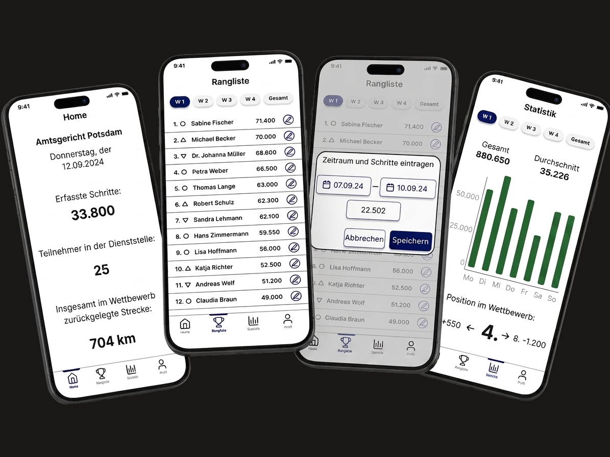
The result is a mobile app built around the real workflow of the challenge.
For participants. Steps are captured automatically, with manual entry as a fallback for missed days. The home screen tracks daily progress and the total distance covered so far. Rankings show how offices perform week by week and overall, while personal statistics show each participant’s progress inside their own office.

The privacy concern became a product rule: across offices, the app focuses on office totals rather than individual names. Individual comparison stays within a user’s own office, where it is more relevant and less exposed.
For coordinators. The same app includes a manager mode. It shows the office’s total progress, its participant roster and its position in the wider competition. Coordinators can also correct individual step entries, replacing one of the most time-consuming parts of the old Excel workflow.
The feature scope followed a must-have and nice-to-have structure. We prioritised automatic capture, office rankings, personal comparison, notifications, manual step entry and manager tools before secondary features such as weekly rankings, individual statistics and settings.
05 · Impact
RunForRecht turned a delayed, email-bound reporting process into a live mobile workflow shaped around participant motivation and coordinator work.
The project took first place of six teams in the end-of-semester jury, with the client on the panel.
After the semester, the authority approached the team about putting the app into real use.
06 · Reflection
The strongest part of the project was the translation from organisational workflow to product structure. The app did not simply digitise the Excel sheet. It separated participant needs from coordinator needs, preserved the team logic of the challenge and turned a privacy concern into concrete visibility rules.
The visual design was functional, but safer than it needed to be. Today I would push hierarchy, contrast and typography further, especially in the ranking and statistics screens, and refine the onboarding so first-time users immediately grasp the relationship between personal progress, office ranking and coordinator corrections.
What held up well was scope discipline. We sorted features into must-have and nice-to-have early and built the core workflow first: step capture, rankings, notifications and manager corrections. That kept the project focused even as the app grew into a working prototype.
01 · Context
ToolSynergy was developed as my bachelor’s thesis at TH Mittelhessen in 2023, guided by one research question: how can a tool-sharing platform reach its audience through a coherent social media strategy? I worked independently across research, strategy, copywriting and visual design.
The starting point was intentionally open: a tool-sharing platform for borrowing and lending equipment, but without a clear communication layer.
02 · Problem
The core problem was strategic coherence. Tool sharing sits in a competitive part of the sharing economy, where platforms rely on similar promises: convenience, sustainability, access or community. Without a clear position, ToolSynergy would risk becoming interchangeable.
The project therefore needed a system that ties market positioning, audience needs, brand messaging, content formats and visual identity together.
03 · Process
I started by building the strategic foundation through desk research. The analysis looked at the German DIY market, changing attitudes toward ownership, cost-saving motivations and the role of sharing within local communities.
A competitor audit then mapped five existing tool-sharing platforms across two tensions: sustainable versus convenient, and individual versus collective.
The matrix revealed an open space in the collective and convenient quadrant. That gap defined the strategic direction. ToolSynergy would give people access to tools and make that access feel community-driven.
To make the audience more concrete, I translated the research into two behavioural archetypes:
The Practical Expert
A skilled, time-limited user who needs quick access to reliable equipment and values quality, clarity and technical know-how.
The Occasional Urban Creator
A budget-conscious, space-limited user who needs occasional access to tools, creative inspiration and approachable guidance.
These archetypes shaped the channel logic, content needs and tone of voice. The name carries the same positioning. ToolSynergy pairs the functional category with the idea of achieving more together, and the German claim “Gemeinsam mehr schaffen” extends that promise across the entire system.
04 · Solution
The final outcome is a system in three layers: strategy, content and identity.
The strategic layer. ToolSynergy is positioned as the community-oriented option in the tool-sharing market. Its guiding idea is simple: connect, share, create. This idea is translated into five core messages: community, time-saving, inspiration, trust and accessibility.
The content layer. Each core message becomes one repeatable content format. Community is expressed through shared-project photography. Time-saving becomes short how-to videos. Inspiration becomes finished-project showcases. Trust is built through FAQ and story-based posts. Accessibility is shown through tool spotlights that explain what is available and how it can be used.
A system built to run over time without losing consistency, not a set of one-off campaign ideas.
Each format includes a clear purpose, suitable channels, cadence and a recurring hashtag. This turns the brand strategy into a practical editorial system rather than a static brand statement.
The identity layer. The visual identity combines a bold wordmark with an open wrench symbol, a palette of deep blue, light blue, orange, grey, black and white, and a type pairing of Open Sans and Alternate Gothic.
The palette maps onto the core messages. Deep blue stands for trust, light blue for inspiration and orange for the open, accessible side of the community, while grey, black and white keep the frame neutral.
Open Sans supports clarity and readability, while Alternate Gothic gives headlines a stronger editorial presence. A rough brushstroke acts as a recurring graphic element, keeping the brand practical, human and connected to hands-on making.
All core elements were consolidated into a styleguide, so the system could be applied consistently across formats, channels and future brand materials.
05 · Impact
As an academic case study, ToolSynergy does not claim launch metrics. Its value lies in the design methodology: turning an undefined premise into a coherent strategic system.
The project demonstrates the work that happens before an interface is built: understanding a market, identifying a competitive position, defining audience needs and translating strategy into repeatable communication and visual patterns.
The case stands for the strategic side of my design work: systems thinking, brand consistency and structuring communication before moving into the product experience.
06 · Reflection
The main limitation is that the strategy was not tested in a real market. The system was conceptually grounded, but not validated through live content, user behaviour or campaign performance.
The second limitation is that the project stopped at the communication layer. It defined how the brand speaks and appears, but not how the digital product itself works.
Today, I would extend the case into the product experience: onboarding, tool search, trust mechanisms, booking flows and community features. In hindsight, ToolSynergy marks an important transition in my work. It taught me how to build a coherent brand system from research, but it also showed me where my focus moved next: from how a brand communicates to how a digital product behaves.
01 · Context
This is the second version of my portfolio. The first went live in early 2024 for an Interface Design seminar and carried a headline, “Rethinking Boundaries”, that no longer matched my own voice.
It worked as a student project, but not as a professional portfolio. So I treated the redesign as a product problem: clarify the positioning, structure the content, define the interaction model, design the visual system and build it by hand.
02 · Problem
The visual style was the smaller issue. The real gap sat between what the site suggested and what it proved.
A portfolio for a Product Designer is read as evidence. The writing, hierarchy, interaction design, technical execution and case structure all become part of the evaluation. In my case, the site also had to show that I can connect design decisions with front-end implementation.
The brief I set myself was therefore simple:
Make the portfolio itself demonstrate the way I work.
03 · Process
I began with an audit of the old version. One idea survived: the nested V/L wordmark, which I rebuilt from Lora’s letterforms to make it feel more intentional and typographic. Everything else was reconsidered.
Instead of starting in code, I worked through positioning and structure first. I researched editorial portfolio formats, reviewed how strong product design portfolios frame case studies and defined the role I wanted the site to communicate: a Product Designer working at the intersection of interaction design, information architecture and code.
That decision shaped the whole direction. The hero statement, navigation, case structure, visual rhythm and technical choices all had to support the same idea. The concept phase took longer than the build, which was deliberate. The thinking defined the code, not the other way around.
The implementation followed that direction. Astro provides the framework, and vanilla CSS with custom properties acts as the design-token layer. GSAP and Lenis drive the two-phase scrolling, the fonts are self-hosted for EU privacy compliance, and the site is deployed on Vercel.
I also used AI selectively as an implementation partner. It helped accelerate repetitive development work, but the architecture, interaction logic, type system, content structure and final decisions remained mine.
04 · Solution
The final result is a portfolio built as a coherent digital product.
The visual foundation. The visual direction is dark, editorial and restrained. Lora and Inter create a contrast between expressive headlines and clear interface text. Colours, spacing, typography and layout decisions are handled through reusable tokens, so the interface stays consistent and maintainable.
Each case study has its own accent world, while the surrounding site interface stays neutral. This lets the projects carry their own atmosphere without breaking the overall portfolio.
The interaction model. On desktop, the site uses a horizontal reading flow supported by custom two-phase scroll logic. The goal is to make the portfolio feel more like a curated sequence than a standard vertical page. On mobile, the layout falls back to a conventional vertical flow.
The experience includes keyboard navigation, visible focus states, reduced-motion handling and self-hosted assets. These were part of the initial build, not fixes added afterwards.
The writing framework. The writing was treated as a core design layer. Every case follows the same structure, but each one keeps its own focus: context, problem, process, solution, impact and reflection.
The goal was to make each case easier to evaluate rather than more impressive through volume. The copy had to be specific, readable and honest about the limits of each project.
05 · Impact
The redesign turned a generic student portfolio into a hand-built showcase for my current design practice.
A personal project has no launch metrics to point to. The evidence is the artefact itself: the site demonstrates positioning, information architecture, visual system design, interaction design, writing and front-end implementation in one place.
The site is the case study: one person, from positioning and writing to visual system and front-end implementation, with no template between the idea and the screen.
For recruiters and product teams, the portfolio now shows how I structure decisions, build systems and connect design intent with technical execution.
06 · Reflection
The horizontal scroll is the most deliberate risk in the project. It makes the site more distinctive and supports the editorial concept, but unconventional navigation always has a usability cost.
For now, the interaction is intentional, responsive and supported by fallbacks. Still, I do not want to defend it only as a stylistic choice. The next step is to observe how real recruiters, designers and hiring managers move through the site. If the navigation creates more friction than value, I will simplify it.
The second limitation is the sample size. The site is designed for the teams and recruiters I want to reach, but it has not yet been tested with enough of them. The next iteration should be based on actual behaviour: where people enter, what they read, where they hesitate and whether the case structure helps them understand my work quickly.